

Slow Jam BBQ Branding
I don’t feel nothing wrong with a little rump and rind.. 🐖🔥


“Slow Jam BBQ allows Fresh Food Design to expand the concept to new markets with enhanced menus and events,” says Matt Clervi, CEO of Fresh Ideas. “We will create exceptional seasonal farm-to-table menus with Slow Jam BBQ. The versatility of BBQ provides fun, fresh food experiences, which is what Slow Jam BBQ is all about.” via Fresh Ideas.

LOGO SPECIFICATIONS
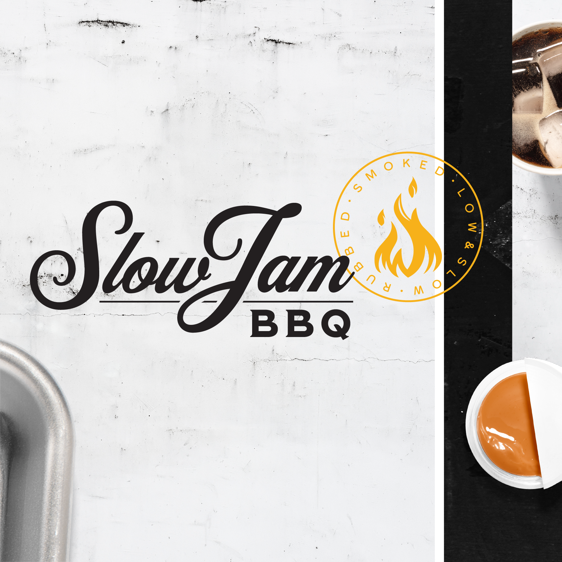
As trends emerge and change, the Slow Jam BBQ logo provides brand consistency and recognition. Slow Jam BBQ utilizes a logo and several symbols. The primary logo is the best fit for most marketing communications.
The primary and preferred logo is horizontal. There is a stacked vertical option for use as well.
The primary logo is most suitable for embroidery, promotional items and when there are size constraints.
The supporting symbols (flame and stamp) may be used as design assets to reinforce the brand’s identity.
TEXTURES
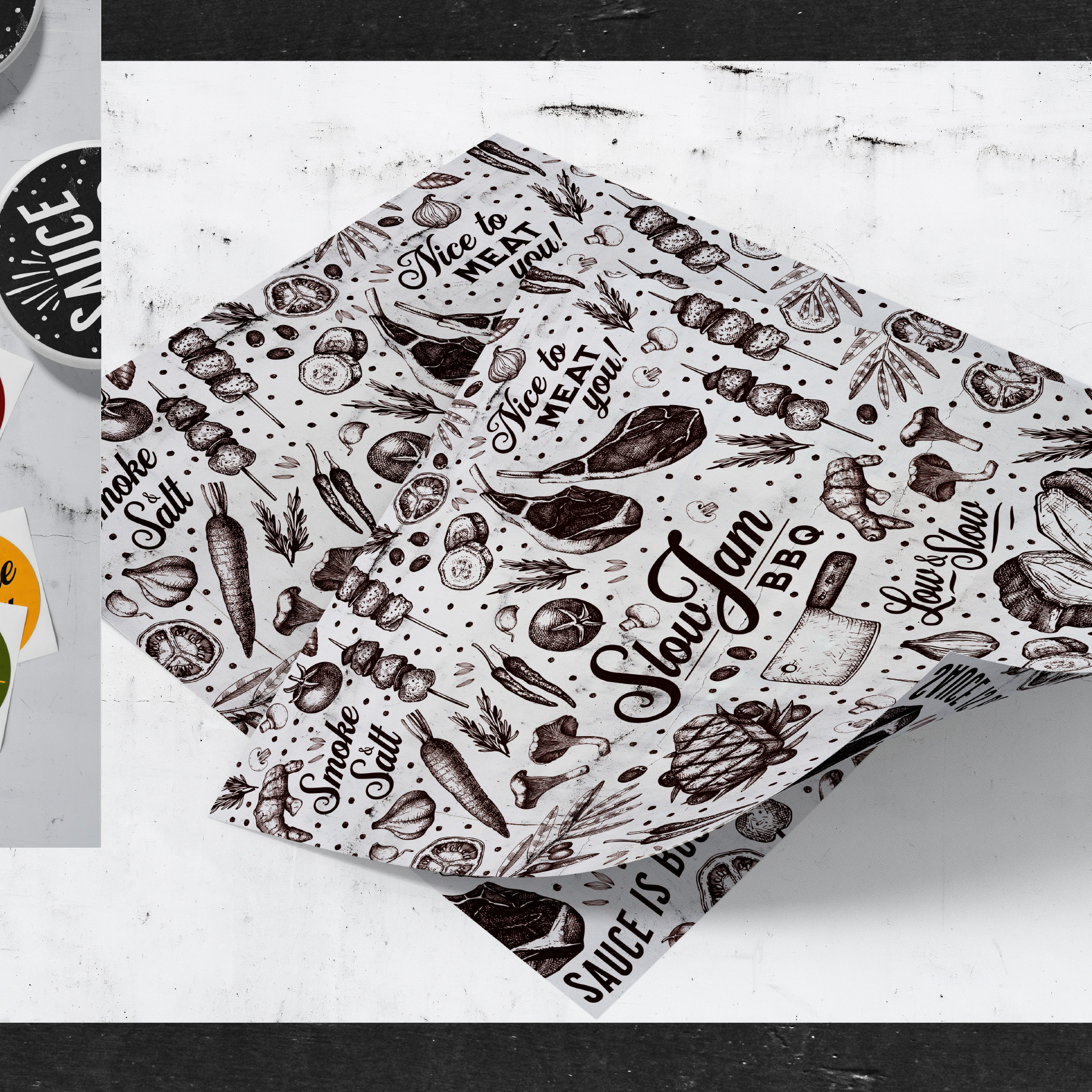
A variety of textures will emphasize and add grit to the Slow Jam BBQ concept. Textures help with brand continuity and also add depth to the overall brand aesthetic.
PHOTOGRAPHY
The Fresh Ideas marketing team will plan a special photoshoot in conjunction with Chef Cheyney to showcase the chef’s talents. Until then, existing stock vector artwork will be selected to supplement marketing materials.

COLOR PALETTE
Slow Jam BBQ utilizes an earthy color palette to emphasize the connection of farm to table ingredients.
The official color palette for Slow Jam BBQ consists of the following:
Pantone 7642
Pantone 5757
Pantone 1235
Pantone 476
Pantone Black
Pantone Black - 10%
TYPOGRAPHY
Slow Jam BBQ utilizes a variety of typefaces in marketing communication. The concept art utilizes the Milkstore family of typefaces:
01 | Clean | Rough | Textured
02 | Clean | Rough | Textured
03 | Clean | Rough | Textured
04 | Clean | Rough | Textured
05 | Clean | Rough | Textured
Slow Jam is rendered from typeface Milkstore 01 Clean with customized handlettering on the letter W. The BBQ is derived from companion typeface Milkstore 03 Clean which gives the design a classic, vintage flair.
Other typefaces may be used to convey specific themes and tones of special events, when appropriate.
